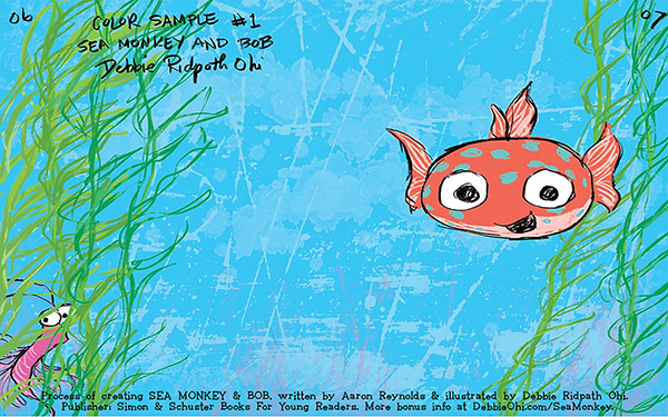
Debbie started to experiment with different colors for the main characters as well as different techniques for the watery background:
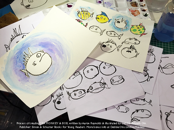
She did many, many sketches of the characters.
Debbie also started doing “thumbnail sketches” (very small, rough sketches) to figure out the general layout of all the illustrations:
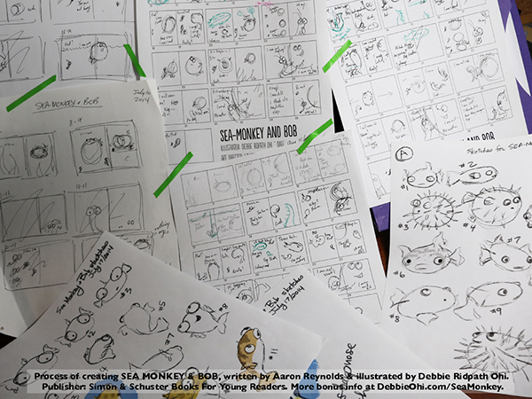
In the early stages, Debbie just does very rough sketches. She doesn’t try to make everything perfect because early on because she knows so much is going to change. Not worrying about trying to be perfect also makes it easier for her to just play around and experiment with different ways of illustrating the story.
This is what Debbie’s office looks like:
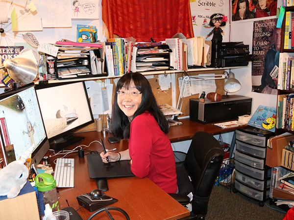
As you can see, she has a lot of things in her office!
For the art in Sea Monkey & Bob, Debbie drew the ink outlines with her Pentel Pocket Brush:
Then she scanned the drawing into Photoshop, a program she has on her computer, and removed the background:
Debbie did this so she could add her own background, experimenting with different textures and color combinations.
Here are just a few of her experiments for the opening spread of the book:
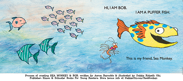
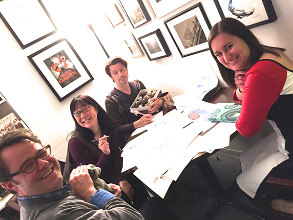
When Debbie had a lot of help and advice from her friends at Simon & Schuster Children’s:
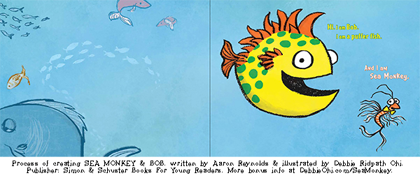
Here is the final version of this spread, after art director Laurent Linn cropped the image and added the text:
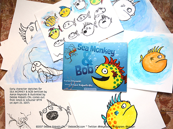
Some time after the final art was handed in, the f&gs (folded-and-gathered proofs) arrived. It’s usually at this point that I like looking over my early character sketches to see how much my art has changed (and what hasn’t changed):
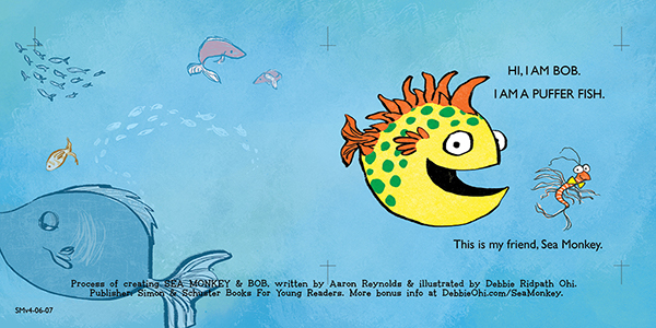
And then (THEN!!!!!) SEA MONKEY & BOB came out in bookstores!!!!